Research Motive
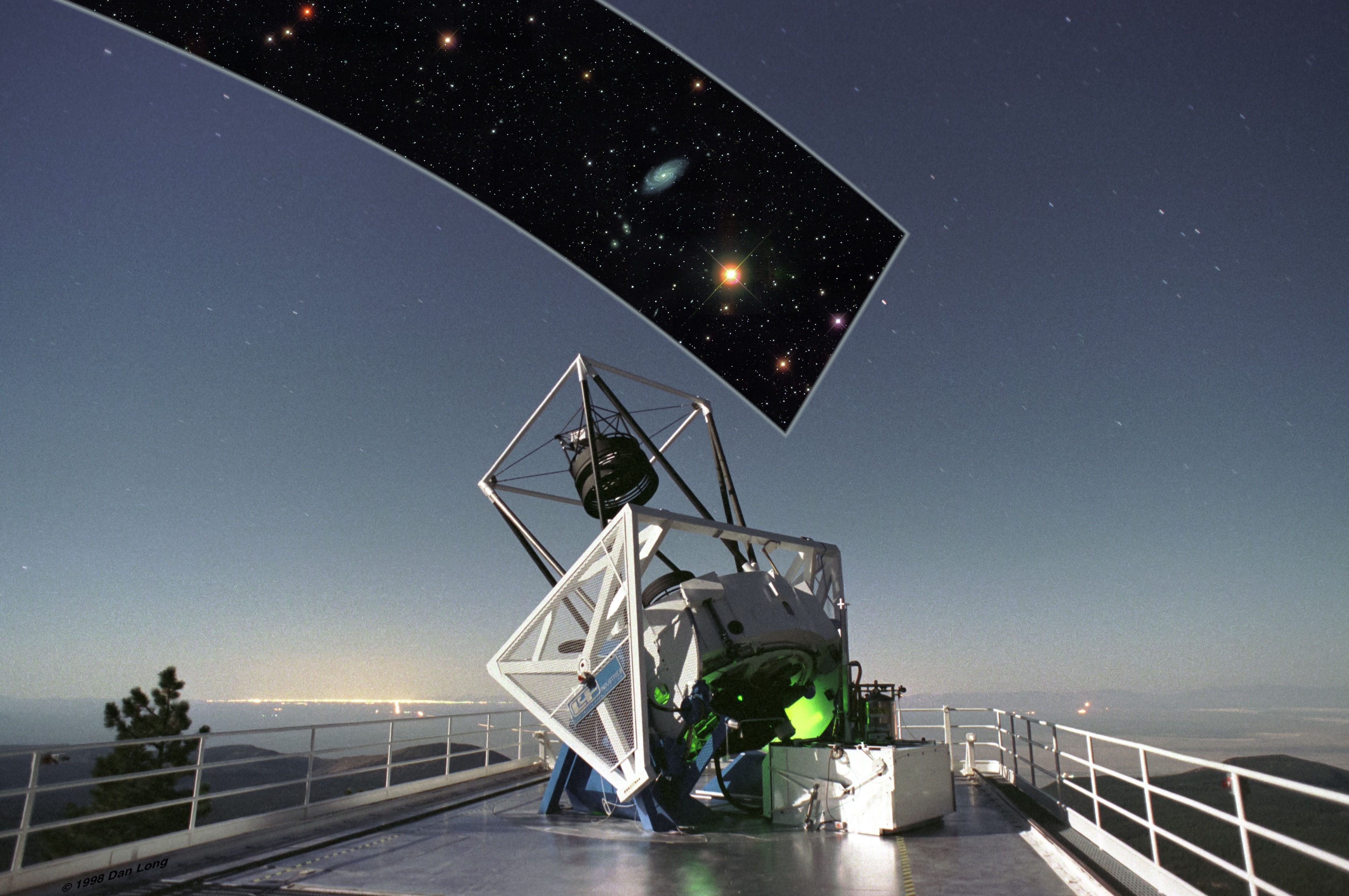
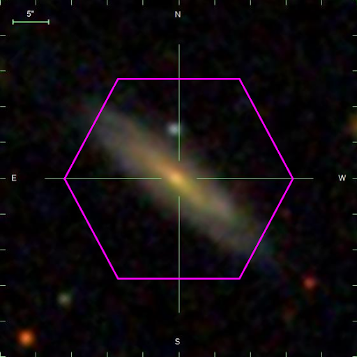
While I was at NYU, I conducted research on galaxy classification and evolution using large datasets from the Sloan Digital Sky Survey (SDSS). I analyzed the light from 10,000 galaxies captured by the SDSS telescopes located at the Apache Point Observatory in New Mexico. To do this, I wrote a Python script to retrieve the data and measure the brightness at the center of each galaxy. This central brightness, or central flux emission, provides valuable information about the energy and activity happening at the heart of these celestial objects. By studying this data, we can better understand the fascinating properties and behaviors of galaxies in our universe.
Spectral Lines
Different chemical elements can emit or absorb specific wavelengths of light. Each element has a unique set of energy levels that its electrons can occupy. When an electron transitions from a higher energy level to a lower one, it releases energy in the form of light. This emitted light can have specific wavelengths or colors associated with it, forming an element’s spectral lines, or emission lines. The ionized gas in galaxies can excite the elements within the galaxy and contributes to its brightness.
Visualizing Photoionization Sources on the BPT Diagram
There are many mechanisms, called photoionization sources, that contribute to a galaxy’s brightness, or flux emission. The gas in galaxies can be ionized by star-forming regions, active galactic nuclei (AGN: extremely bright compact regions at the center of some galaxies, usually fueld by a supermassive black hole), or by a mix of both.
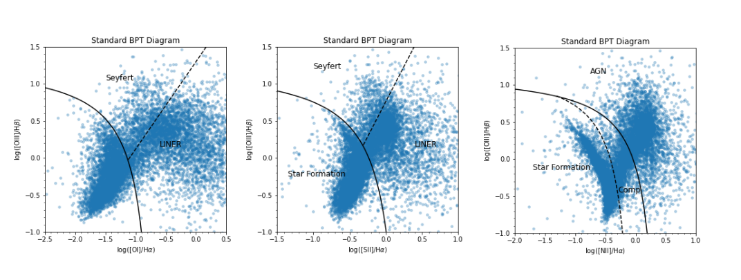
In my project, we wanted to determine what photoionization sources are the main culprits for each galaxy’s central flux emission. To do this, I visualized my central flux measurements on The Baldwin-Phillips-Terlevich (BPT) diagram. It is a scatter plot that helps classify and understand the nature of the ionizing sources in galaxies based on the emission lines observed in their spectra.
To construct the BPT diagram for the SDSS dataset, I plotted the intensities of specific emission lines from each galaxy spectrum. The plots I created are shown below. The demarcations on the plot are from Kewley (2006) and classify the galaxies as star-forming, Seyfert (active), LINERS (Low Ionization Nuclear Emission-Line Region), or composite (contains ionization from both star-formation and AGN). According to the BPT Diagrams, star-forming galaxies tend to have smaller \( SII/H \alpha \), \(NII/H \alpha \), and \( OIII/H \beta \) ratios.
Implementing a New Projection of the BPT Space
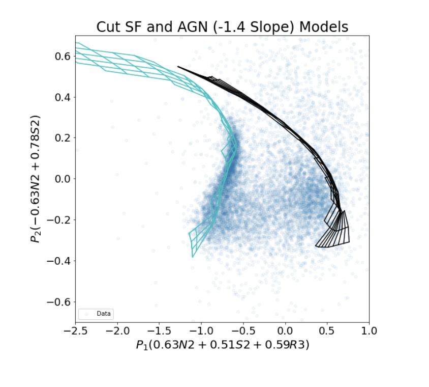
Some caveats with the current BPT diagram space is that there have been classification inconsistencies between diagrams based on different line ratios as well as ambiguities in the composite region (the region in between galaxies purely ionized by star formation and the black model grid represents galaxies purely ionized by AGNs). These inconsistencies could lead to biases in the data analysis. Research done by Xihan (2020) resulted in a new diagnostic diagram that can overcome the caveats mentioned above.
Part of my research at NYU was to implement Xihan’s technique to the central flux measurements. The plot I created for the SDSS dataset using Xihan’s method is shown below. The cyan model grid represents galaxies purely ionized by star formation and the black model grid represents galaxies purely ionized by AGNs. With this new BPT space, we can clearly see the separation between composite galaxies and the two pure model grids.
Further research would include computing the fractional AGN contributions for the composite regions, in other words, computing how much of the ionized gas is ionized by an AGN.
The jupyter notebook that holds the code for this research is found here.